Knowledge
10 Types of Charts: Data Insights with Visualizations

TRUSTED BY BEST-IN-CLASS BRANDS


What’s that one thing available in abundance, but you can’t make even the slightest sense of it unless you have it meticulously arranged? Oh yes, if your guess is data, you’re spot on! Now again, how do we perfectly lay it on the table? One popular way is using different types of charts and graphs!
Surprisingly, that’s precisely what we are going to explore right now! What a coincidence!
In this blog, we will look into four categories of charts.
Let’s crack the code!
But, before that, we need to understand…
The Importance of Visualizing Data
Seeing is understanding when it comes to the world of numbers. Why?
Well, because looking at charts and graphs makes data easy. Imagine staring at a bunch of numbers—it’s like decoding a secret language.
But with visuals, it’s like a map guiding you through a data adventure. That’s why visualizing data is crucial. Let’s add a few more reasons:
1. Clarity in Complexity
Have you ever tried solving a puzzle with missing pieces? Data can feel like that—complex and confusing. But introducing visuals is like turning chaos into clarity. Visuals simplify the mess, revealing patterns and trends that were once hidden. It’s your data roadmap, making navigation a breeze.
2. Informed Decision-Making
Every day, we make choices, big and small. But how do you ensure they’re the right ones?
Visualized data is your secret weapon. It transforms decision-making from a guessing game into a strategic endeavor. It’s like having a crystal ball, shedding light on opportunities and forewarning of potential challenges.
3. Spotting Trends and Anomalies
Numbers can be deceiving. It can hide crucial trends and anomalies. But visuals are like turning on a light in a dark data-filled room. Suddenly, patterns emerge, and anomalies become apparent. It acts as a spotlight, revealing the true story behind the numbers.
4. Efficient Communication
Have you ever tried explaining a complex report using just words? Tricky, right?
Visuals make communication efficient, serving as a common language for teams. They connect everyone on the same visual page, making discussions clear and concise.
5. Universal Understanding
Words may differ, but visuals are a universal communicator. They transcend language barriers, creating a shared understanding. It’s like speaking a language everyone in the room comprehends.
So, it is all about making sense. Am I making sense?
Now since that’s covered, let’s look at the different types of charts that help you make the most of your data.
Read More: IoT Data Collection and Visualization: How to Use it to Understand Big Data
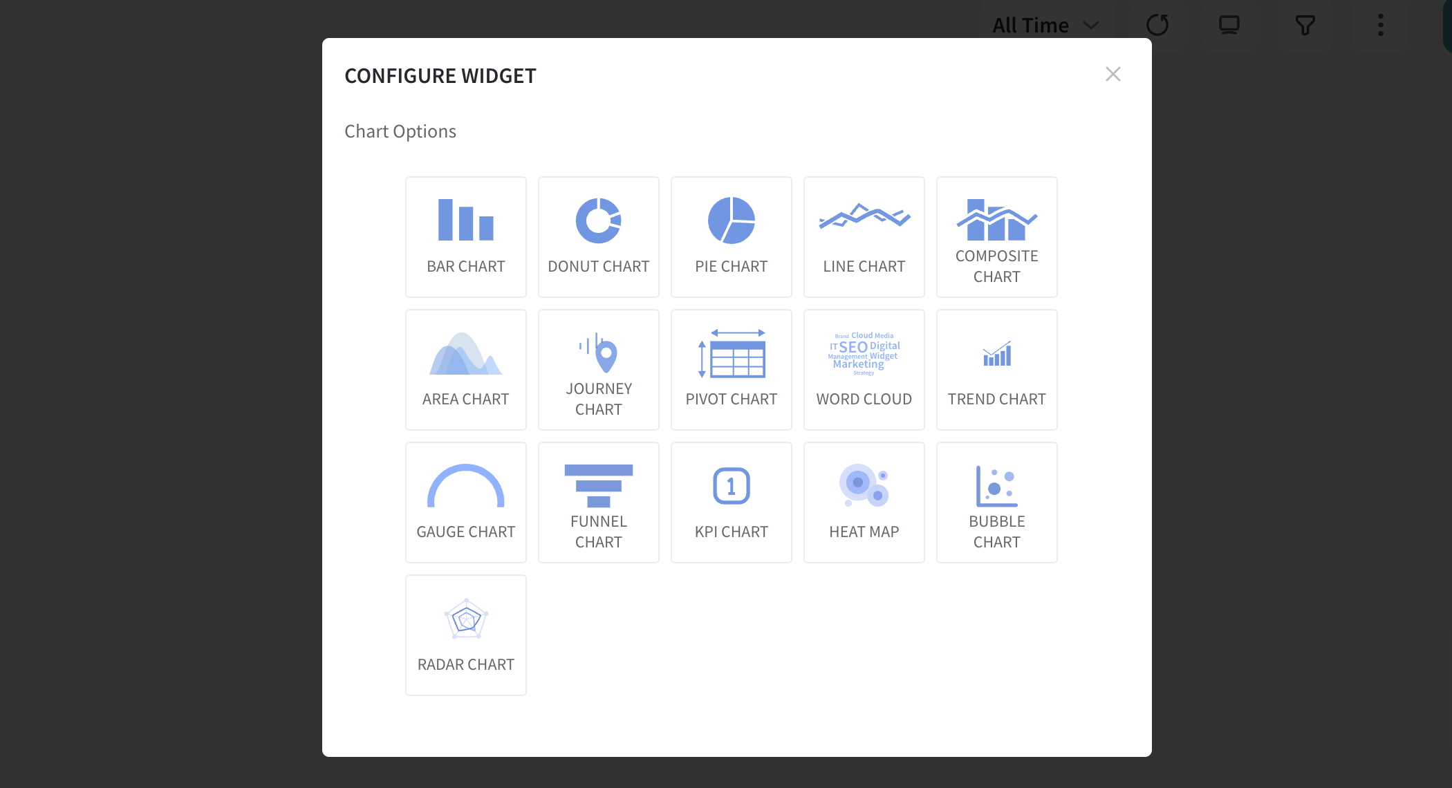
10 Unique Types of Charts
Just as data are abundant, there are many choices for types of charts.
But hold up! I will talk about the most effective and essential ones I have used while customizing my dashboards with SurveySparrow.
Oh, wait, don’t just take my word for it; let the facts speak for themselves!
Basic Types of Charts
Basic charts are like the go-to tools—simple yet strong. They lay the foundation for understanding data quickly.
Think of them as the starting point before you dive into the complexity. Let’s look at each primary chart type to see how they work.
1. Vertical Bar Chart
A vertical bar chart visualizes data using vertical bars, each corresponding to different categories or groups. The length of each bar reflects the quantity or value it represents. This type of chart is particularly effective in comparing values across distinct categories.
Key Features
- Clarity in Comparisons: They provide a clear and straightforward way to compare values between different groups or categories.
- Ease of Reading: The simplicity makes them easy to read and understand. Each bar stands as a distinct visual entity.
- Versatility: It adapts well to showcasing both small and large datasets.
- Visual Hierarchy: You can quickly identify highs and lows among the represented values.
- Space Efficiency: Vertical bar charts are space-efficient. They offer a compact yet comprehensive representation of data.
Where Can It Be Used?
Let’s look at this with an example.
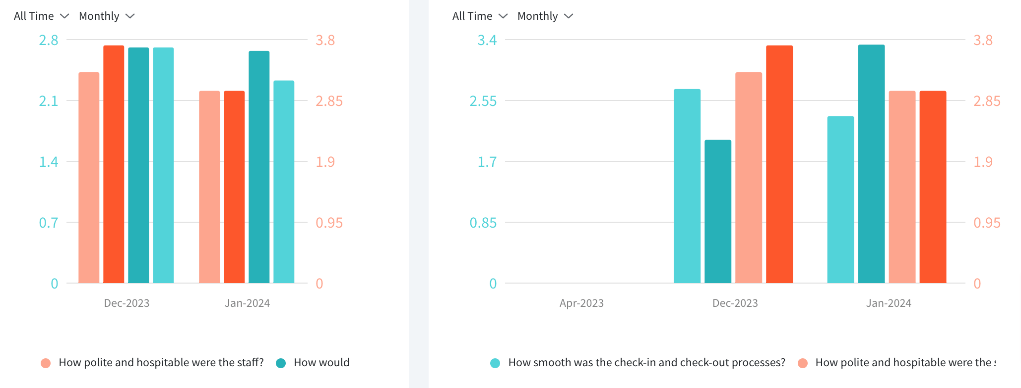
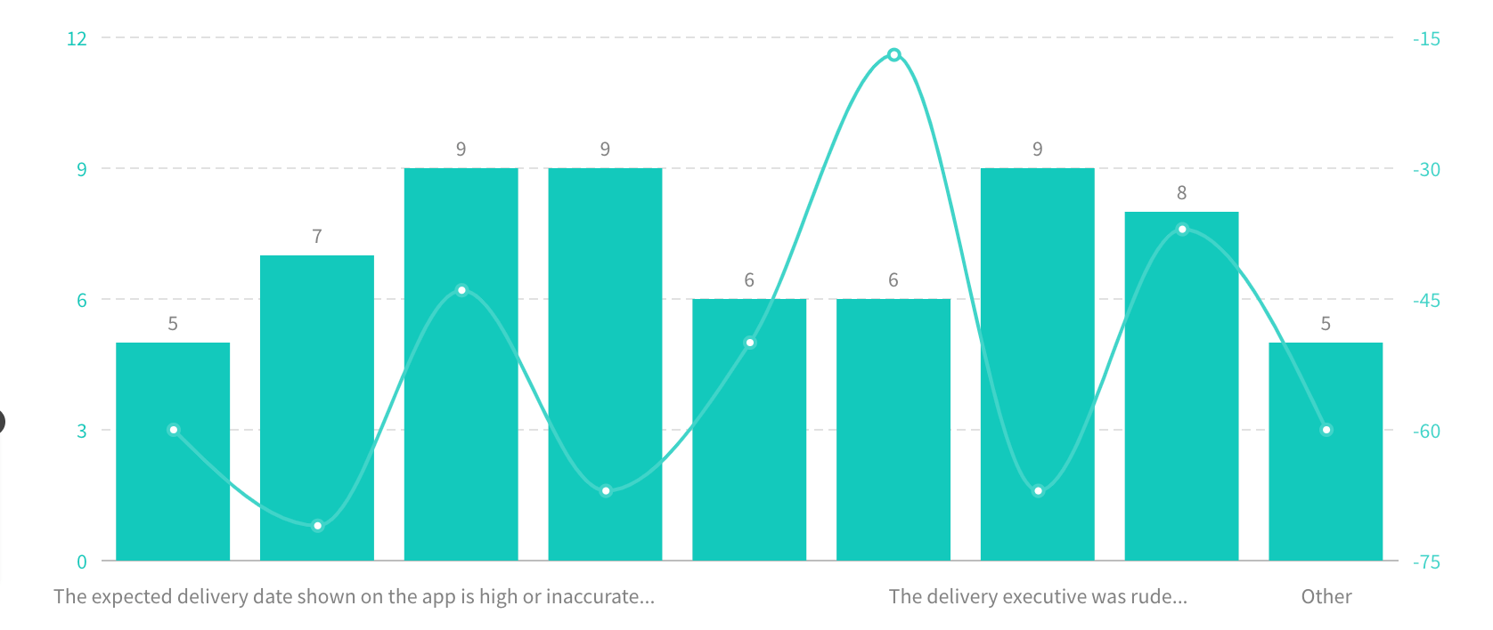
Imagine a post-purchase survey where customers rate their satisfaction levels. A vertical bar chart can visually represent the distribution of ratings, making it easy to identify the most and least satisfied segments.
A vertical bar chart can effectively display the distribution of responses. It enables stakeholders to grasp the overall sentiment and identify areas for improvement quickly.
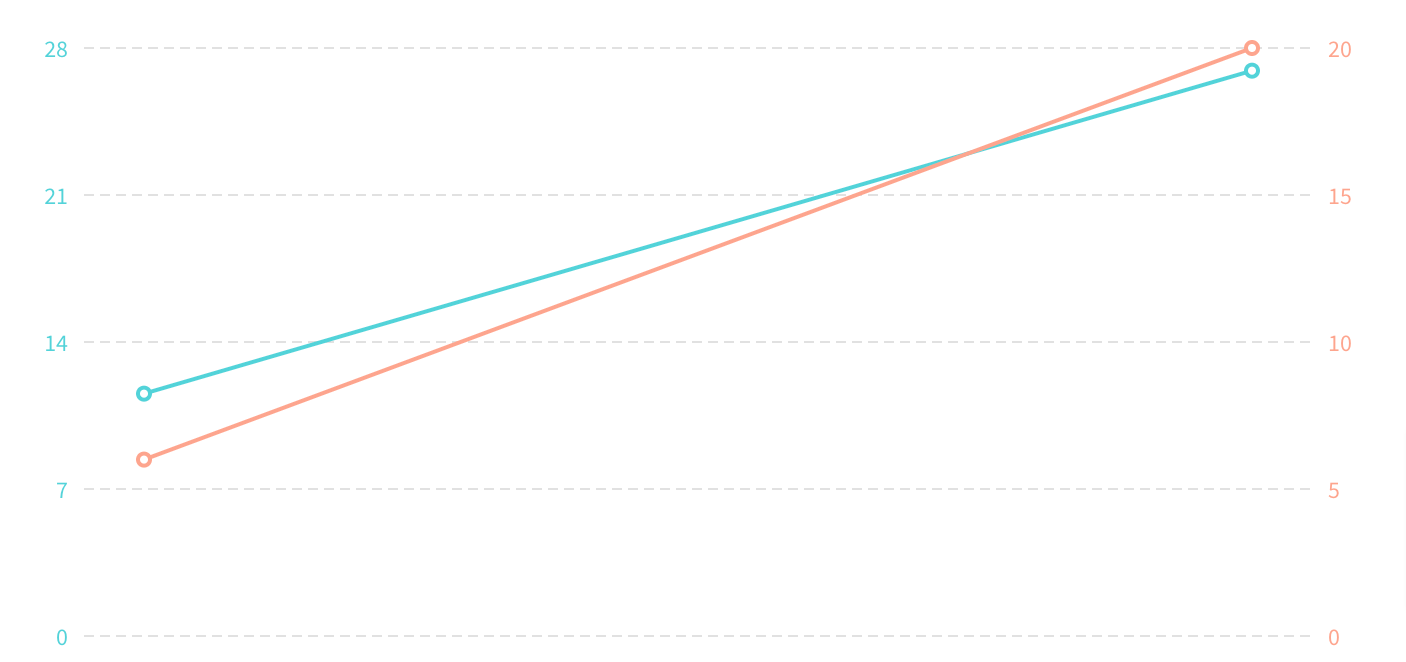
2. Line Chart
A line chart is like a visual storyteller for data, showing how things change over time. Picture a smooth line gliding across a graph, telling the tale of value ups and downs. It’s like a timeline that reveals trends, making it perfect for tracking changes and spotting patterns in information.
Key features
- Trend Tracker: Great at showing trends over time, like a story unfolding.
- Continuous Flow: The line is continuous, making it ideal for things changing steadily over time.
- Compare and Contrast: This lets you compare trends on one chart.
- Tell a Visual Story: Turns data into a story with a visual journey through progress or setbacks.
- Spot Peaks and Valleys: It is easy to spot high and low points in data, whether it’s stocks or website visits.
Where Can It Be Used?
Let’s say you’re checking how effective your marketing efforts have been over time. A line chart can take you on a visual journey through changes in key indicators. It’s like having a visual roadmap to guide your marketing decisions.
Now, imagine you’ve been analyzing website traffic for over a year. The line chart tells a story of the website’s popularity, showing peaks when it’s buzzing and valleys when it’s quieter. This visual helps you plan content or promotions based on past trends for better engagement.
3. Area Chart
An area chart is a visual representation of data that builds upon the concept of a line chart. It not only showcases trends over time but also emphasizes the cumulative total of a variable.
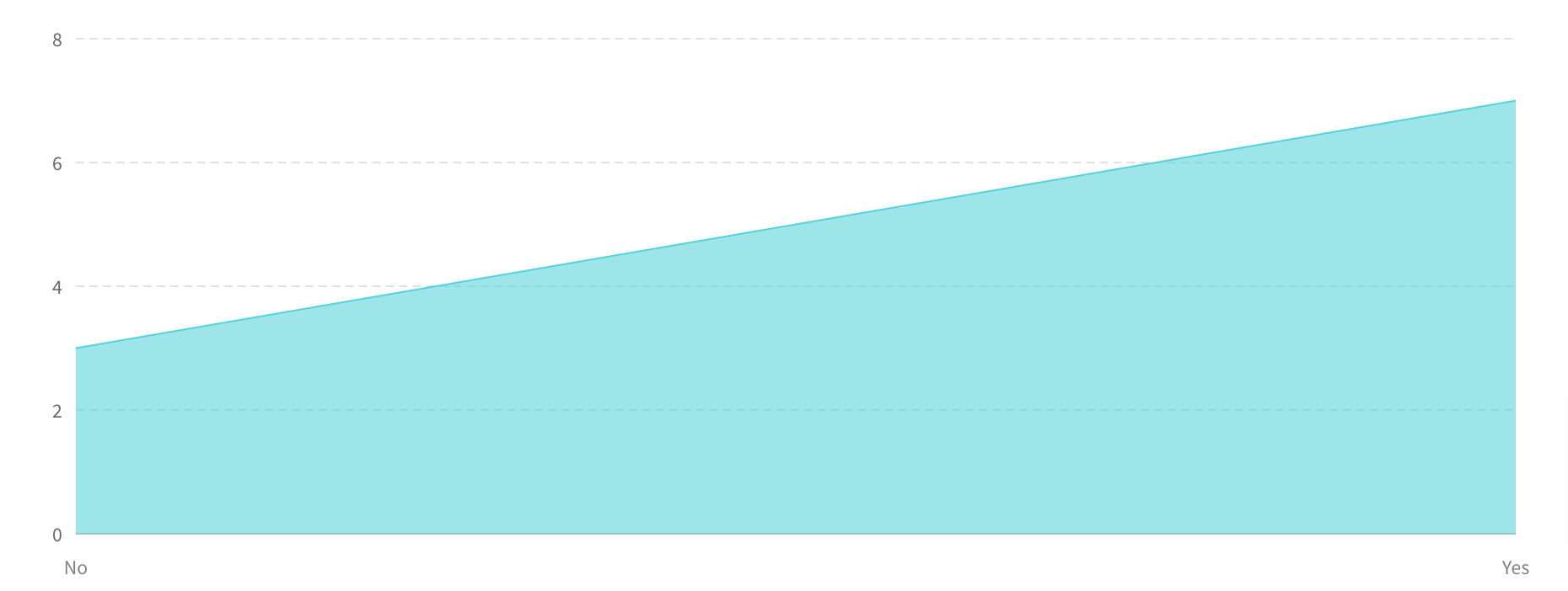
Looking closely, you’ll see that the area beneath the line is filled with color. This creates a visually impactful representation of how values evolve and accumulate over a specified period.
Key Features
- Trend Focus with Total Insight: They track trends like line charts and emphasize the total impact. It’s a dual perspective.
- Smooth Visual Transition: The filled area beneath the line ensures a smooth visual journey through data transitions. (Makes it easy on the eye)
- Colorful Impact and Clear Sections: Colors in the filled area add visual appeal and clarity.
- Comparison Across Categories: Whether it’s sales for products or website visits by region, this chart type fosters easy visual comparisons.
- Spotting Highs and Lows: Area charts simplify the identification of ups and downs. The filled area adds emphasis. You get to notice the critical points in the data quickly.
Where Can It Be Used?
Let’s picture a company assessing its quarterly earnings. The area chart vividly displays trends for each income source, using colors to tell how each contributes to the overall earnings landscape.
It’s like seeing the financial landscape in living color, helping you make informed decisions for the future.
Now, let’s move to…
Specialty Charts
Specialty charts are unique. Unlike the usual charts you see, these are designed for specific needs. They come into play when regular charts might not tell the whole story.
They are customized options catering to specific data situations, offering a different way to understand and present information.
1. Donut Chart
A donut chart is a circular data visualization resembling a pie chart with a hole in the center, creating a “donut” shape. It presents data in slices, each representing a proportion of the whole.

The central hole allows for additional information or a focus on the overall context.
Key Features
- Proportional Display: Slices show how each part contributes to the whole, visually representing proportions.
- Central Information Hub: The central hole allows for additional info or a summary, making the chart more versatile.
- Improved Readability: Donut charts offer more precise labeling and readability than pie charts.
- Visual Focus: The absence of data in the center directs attention to the surrounding slices, emphasizing specific categories.
- Colorful Emphasis: Strategic use of colors highlights slices or key data points, enhancing visual communication.
Where Can It Be Used?
A donut chart is handy for showcasing sales distribution across product categories in a sales analysis. The central opening can display total sales, and each slice represents the contribution of a specific category.
For instance, if it is a business reviewing its annual sales-
The donut chart breaks down sales distribution for categories like electronics and clothing. The central opening displays total sales. This helps stakeholders quickly identify the driving categories and make informed decisions.
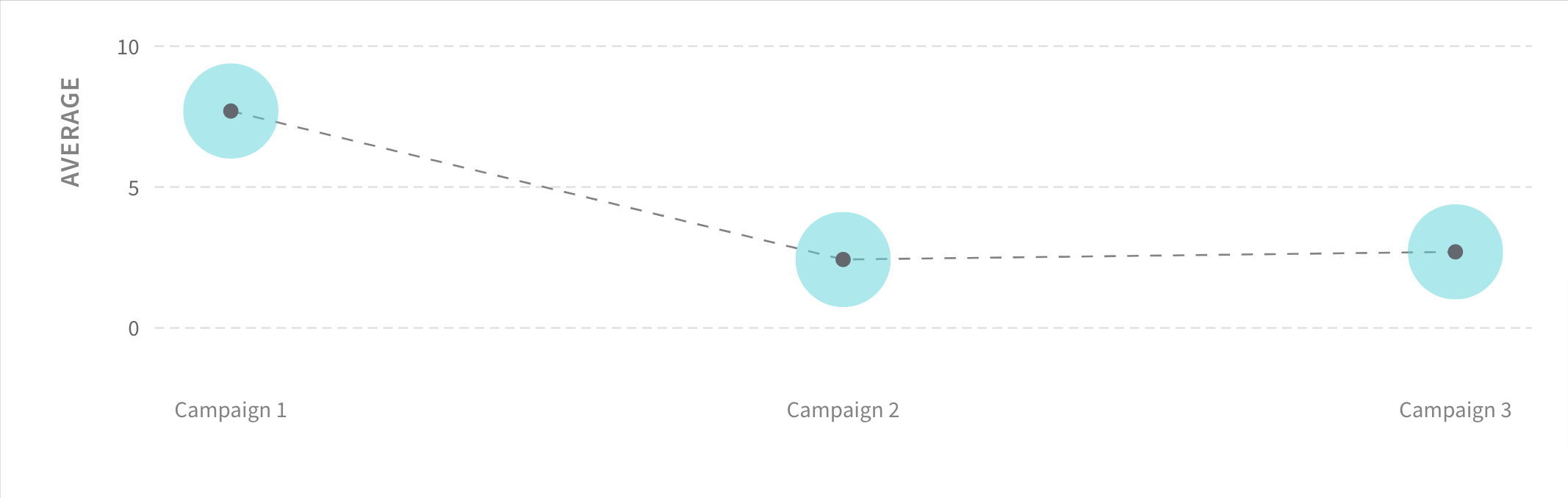
2. Bubble Chart
A bubble chart adds a third dimension to traditional two-dimensional graphs.
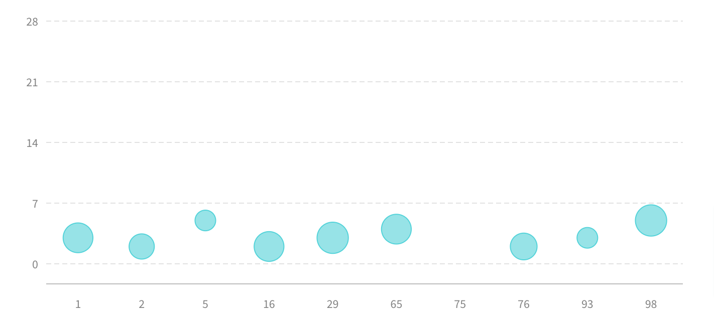
Instead of just points, it uses bubbles of varying sizes to represent three sets of data—typically the x-axis, y-axis, and a third variable indicated by the bubble size. This chart type provides a visual representation of relationships and comparisons within datasets.
Key Features
- Three-Dimensional Insight: Bubbles introduce a third dimension. This provides a visual representation of three variables simultaneously.
- Significance in Bubble Size: Bubble sizes convey the magnitude of a third variable, offering quick visual insights.
- Comprehensive Data Comparison: Bubbles are quite helpful in comparing data points across three variables, enhancing data analysis.
- Versatile Interpretation: Suitable for various data types, a bubble chart goes beyond traditional representations for flexible interpretation.
- Visual Narrative for Storytelling: Varying bubble sizes and positions create a visual story, making it practical for conveying data patterns.
Where Can It Be Used?
A bubble chart visualizes task urgency, importance, and resource needs in project management.
Imagine a project with multiple tasks. The bubble chart showcases each task’s urgency, importance, and resource requirements. The larger bubbles indicate more resources needed, while positions reveal urgency and importance.
This visual aids quick identification of critical tasks, guiding effective project management decisions.
3. Radar Chart
Psst..did you know that a radar chart is also called a spider web chart?
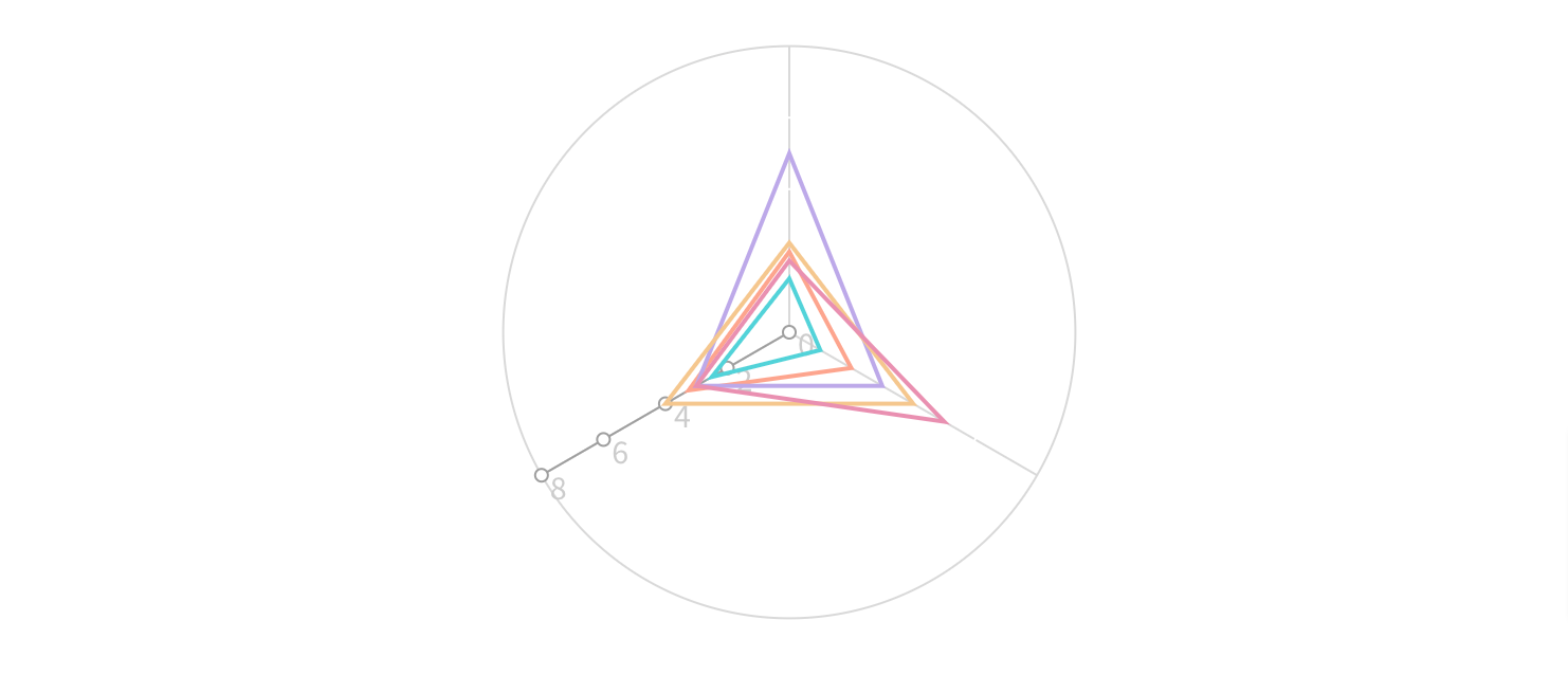
It is a unique data visualization that displays multivariate data as a two-dimensional chart. Data points are plotted on these axes, and their connection forms a shape resembling a spider web.
This chart is particularly effective for illustrating patterns and relationships among multiple variables.
Key Features
- Multivariate Representation: Radar charts excel in showcasing relationships among multiple variables simultaneously, providing a comprehensive view of data patterns.
- Centralized Data Comparison: The central point acts as a reference, making it easy to compare data points across different variables on the radial axes.
- Pattern Recognition: The shape formed by connecting data points helps recognize patterns and trends within the dataset, aiding in insightful data analysis.
- Visual Emphasis on Extremes: Radar charts visually emphasize extremes by highlighting the outer edges of the chart, making it practical for identifying strengths and weaknesses in data.
- Comparative Analysis: Ideal for comparing performance or characteristics across multiple entities, as the radar chart visually contrasts the shapes formed by different datasets.
Where Can It Be Used?
Are you a sports fanatic?
Consider a soccer coach evaluating players. The radar chart visually represents each player’s proficiency in skills like dribbling, passing, and shooting.
The unique shapes formed by the radar chart for each player quickly highlight individual strengths and areas that may need improvement. This aids the coach in making informed decisions about player development and strategy.
Advanced Types of Charts
These go beyond traditional types of charts.
These charts are designed to address complex data scenarios and offer more sophisticated insights.
Unlike their simpler counterparts, advanced charts often involve multiple variables, intricate relationships, or the need for detailed analysis. You get a more nuanced and comprehensive view of data.
1. Journey Chart
A journey chart is like a visual story that maps out the sequence of events or steps in a process over time. It’s handy for illustrating how things unfold, highlighting meaningful moments.
Whether it’s tracking a project’s progress, customer experiences, or even your weekend plans, a journey chart gives you a clear picture of the journey’s flow.
Key Features
- Sequential Representation: Journey maps visually represent sequences or steps chronologically. This offers clarity on the progression of events.
- Milestone Highlighting: Important milestones or critical moments in the journey stand out, making it easy to spot significant events.
- Dynamic Visualization: As a dynamic chart, it adapts to changing data and allows real-time updates. This is great for keeping an eye on ongoing processes or projects.
- Layered Information: Information can be layered onto the journey chart. (yes, you can add stuff at each step) This enhances the chart’s depth and informativeness.
- Customizable Paths: Journey charts offer flexibility in creating customizable paths or routes, allowing users to tailor the visualization to specific scenarios or project structures.
Where Can It Be Used?
Now, let’s assume you run an online store. So, what would a journey chart for online shopping look like?
It starts with customers browsing products, adds steps like putting items in the cart and going through checkout, and ends with the purchase. Important points, like confirming payment and tracking delivery, get special attention.
This visualization helps the online store team understand how customers experience the website.
2. Pivot Chart
A pivot chart is closely tied to pivot tables. It allows users to rearrange and summarize complex datasets dynamically for better analysis. Pivot charts offer a graphical representation of data trends, making it easier to grasp insights and trends in large datasets.
Key Features
- Explore with Ease: Pivot charts let you play around with your data to look at it from different angles and see what’s happening.
- Summarize the Big Stuff: They’re like magic for big data sets, summarizing the essential trends without drowning you in details.
- Choose Your Favorite Look: You get to pick how your data looks—whether bars, lines or even pie slices, pivot charts are customizable.
- Click and Explore: They’re not just charts; they’re interactive. Click around to zoom in on specific details or filter out what you don’t need.
- Tell Your Data Story: Pivot charts turn complicated data into stories that are easy to tell, making it simple to share insights with others.
Where Can It Be Used?
This time, imagine you run a lemonade stand and want to know which flavors sell the best in different neighborhoods during different seasons. A pivot chart helps you see the big picture and determine each flavor’s sweet spot.
A pivot chart could show you which flavors are popular in which neighborhoods and when. You could quickly switch between views to see trends over time. This way, you can decide what flavors to stock and where to set up your stand for the best results.
3. Trends Chart
A trends chart visualizes data that helps identify patterns, tendencies, or shifts over a specific period.
It is a valuable tool for recognizing trends or fluctuations within datasets, enabling users to make informed decisions based on historical or evolving data.
It is like a storyteller for numbers—it helps you see how things change over time.
Key Features
- Spotting Patterns: Trends charts are great at showing patterns. They help you see if something is getting bigger, smaller, or steady.
- Time-focused Look: They usually show information over a set time, letting you focus on how things change during that specific period.
- Compare and Contrast: It gives a big picture of how two or more elements relate.
- Easy to See Direction: Using lines or curves, these charts make it clear if something is going up or down, making trends easy to spot.
- Guess What’s Next: Depending on the information, trends charts can even help you make simple guesses about what might happen in the future based on what’s happened before.
Where Can It Be Used?
Shall we stick with the lemonade stand for a little bit more?
Now, a trends chart could show when you sell the most cups. You’d quickly see if more people stop by during hot months or if there are specific days when lemonade is super popular.
Maybe more people buy lemonade in the summer—this chart will show you exactly when that happens.
This helps you plan when to set up your stand for the best sales and understand your lemonade business better.
Now, there’s just one more category left…
Combination Charts
As the name suggests, a combination chart combines two or more different types of charts into a single unified view. It allows users to represent and analyze multiple data sets using various chart formats within the same visual space.
Common combinations include line charts with bar charts, area charts with line charts, or bar charts with scatter plots.
1. Composite Chart
This is your multitasker!
It combines charts, like bar charts and line charts, into one picture. This way, you can look at various aspects of your data simultaneously, making it easier to understand and analyze.
Key Features
- Mix and Match: This helps you showcase various aspects of your data in a single view.
- See the Whole Picture: By combining elements like bars, lines, and points, composite charts offer a complete picture. You get a more detailed understanding of your data.
- Layered Insights: They’re like layers of information. It allows you to see different dimensions of your data in a way that a single chart might not capture.
- Tell a Data Story: Composite charts are great storytellers. They help you convey complex data narratives by showing relationships and patterns across different parts of your information.
- Adapt to Complexity: No matter how complex your data is, composite charts can handle it. They adapt to the richness of your information, making them versatile for various situations.
Where Can It Be Used?
For instance, if you are tracking your monthly expenses, a composite chart might show bars for your total monthly spending, a line indicating how much you spend on groceries each month, and points marking any exceptional expenses.
This visual combo gives you a clear overview of your spending habits, making it easier to identify patterns, set budgets, and manage your finances effectively.
Wrap up!
So there you have it—charts are like your data’s best friend, helping you understand it better. Each type serves a unique purpose, from basic ones like bars and lines to cool combos in composite charts.
Whether tracking your spending, checking out trends, or analyzing a journey, the right chart can make all the difference.
So, the next time you dive into data, don’t forget to bring along your trusty charts—they’re here to make your data journey with “types of charts” a whole lot simpler and way more interesting!
Above all, you get one platform to try out all these charts! What’s that? SurveySparrow!
Take it for a spin today. It’s free!

Charts That Speak: Elevate Your Dashboard Game!
A personalized walkthrough by our experts. No strings attached!


![Customer Feedback System [CFS]: A Mini Guide](/_next/image/?url=https%3A%2F%2Fsurveysparrow.com%2Fwp-content%2Fuploads%2F2024%2F07%2Fcustomer-feedback-system.png&w=3840&q=75 "Customer Feedback System [CFS]: A Mini Guide")

