General
Nominal Data 101: Definition, Examples, Analysis

TRUSTED BY BEST-IN-CLASS BRANDS


Four different data types bring structure to any raw data. They are nominal, ordinal, interval, and ratio. We’ll be delving deeper into nominal data in this article, but not before talking briefly about all of them and discussing what separates each one from the others.
From conducting surveys to running big-money marketing campaigns, you need to know what your data is saying to upgrade and get better. Let’s help you do that by covering all aspects of nominal data.
- Understand what are the four levels of measurement
- Describe nominal data and its characteristics in a nutshell
- Get a nominal data example – or ten.
- Learn the process of nominal data analysis
- Bonus: 7 survey questions you can use to get nominal level data
Introduction: The 4 levels of measurement
Nominal, ordinal, interval, and ratio – these four types of data offer different levels of measurement. These levels determine how a data point is structured or recorded and how this data can be analyzed.
Moreover, nominal data is the least precise and complex, while ratio data is the most complex. The level of complexity and preciseness can be put in a hierarchical order. Here’s how:
- Nominal data – It denotes information that is structured into different labels or categories. These labels don’t have any quantitative value and are purely descriptive.
- Ordinal data – The data in this type is categorized descriptively and ranked in some order or hierarchy. That’s the most significant difference between nominal and ordinal data. This difference also makes ordinal data more precise than nominal.
- Interval data – Interval data is almost the same as ordinal – the information is categorized and ranked in some order. The difference is that there are evenly spaced intervals between the categories in interval data, which isn’t the case in ordinal.
- Ratio data – Ratio data is categorized and ranked with equal intervals between all data points. In addition, it has a true zero, meaning if a data point is null or has no information, ratio data can categorize it or give a zero value to it. This helps in segregating valid data points from the dud ones.
What is nominal data: A definition
We know the 4 data types, of which nominal data is the least complex. Also, it’s the least precise data type – but that doesn’t mean it’s unimportant!
Whenever purely descriptive data is generated with different categories and no hierarchy, that’s nominal data. We can call the categories as nouns, as they’re only descriptive. There’s no quantity or scale of measure attached to it. The categories here can be numbers too, but they won’t represent any kind of order or hierarchy.
What type of data is nominal? The characteristics of nominal data
Let’s look at some key characteristics of nominal data:
- The categories in this data type don’t have overlaps between them. They are all mutually exclusive.
- The categories or labels are purely qualitative. They don’t offer any quantitative insight.
- No comparison is possible using only nominal data, as there’s no order or hierarchy present. Thus, no single category is better compared to the rest.
- You cannot perform arithmetic operations with such data due to a lack of order.
10 nominal data examples
Were you thinking we’ll be talking about nominal data without giving any examples? Nah, not gonna happen.
This section is full of ’em, and they are crucial to understanding what data sets can be categorized as nominal. Time to begin, then.
1. Nationality
This is the most common nominal data example you’ll find. Nationality is a nominal variable whose data comes from multiple categories depicting countries. Examples could be American, Irish, Kenyan, Australian, etc. There’s nothing that can be quantified here or put into hierarchical order. The data just includes countries that people belong to. That’s it. No scale or ranking can be given to that.
2. Blood Type
Another typical nominal data example. Whenever data is collected for blood types, the categories formed are mutually exclusive. O positive, O negative, A positive, and so on. There’s just no relation between any of them.
3. Personality Type
When we’re talking about personality types, we aren’t comparing introverts and extroverts. Nor are we building a hierarchy for the different personality types. People just mention their personality type. Simple and straight. That’s a nominal data example for you.
4. Employment Status
Whether someone’s employed, unemployed, or retired, on what basis will we compare these three categories if we have only this information? So, another example of nominal data.
5. Zip Code
The same is with zip codes. No comparison can be made, or scale can be given for zip codes. They’re unique numbers with only descriptive sense to them.
6. Movie Genre
If we ask you, ‘what movie genre do you like?’ the reply could be action, drama, war, family, horror, etc. But just by looking at the data collected, we can’t say action movies are better than horror. All genres are independent categories that don’t have any relation. Hence movie genre is a nominal data variable, and all the genres are different categories.
7. Political Preferences
Republican, Democrat, or Independent – whatever your political preference is, it’s a nominal variable and a great nominal scale example.
8. Hair Color
What hair color do you prefer? The data collected will have black, brown, blonde, red, etc. But we cannot say which color looks the best only by looking at these categories. We would need an order, a hierarchy, to determine an answer. That cannot be done here; hence it’s a nominal data example.
9. Mode Of Transportation
Preferring to go by bus or train, or maybe you wish to catch a flight? Whatever mode of transportation you choose, the data collected would be descriptive with no way to analyze which mode is the best.
10, Continent
Last but not least. The data on whether someone’s from Europe, Asia, or any other continent is not quantifiable. So nothing can be put forward in determining which continent is better only by looking at these categories.
How is nominal data analyzed?
So, if nominal data is all descriptive, how can it be analyzed? Can it even be analyzed to find something useful? You must be having these questions, and rightly so.
No matter your data type, there are some common steps to analyze and make sense of it. We’ve talked about nominal data while giving 10 top examples for it. The analysis part remains. We’ll do that here.
Step 1: Descriptive Statistics
Descriptive statistics determine how to distribute the data. We use two descriptive statistics methods for nominal data: frequency distribution tables and central tendency, also known as a mode.
1. Frequency Distribution Tables
Let’s imagine the data is about the mode of public transport people living in New York prefer. In its raw form, the data will be categories of “Preferred mode of transport” and the “Location” in New York. The first category could include bus, tram, etc. Second, inner-city and suburbs can be the two options. Unfortunately, there’s no way to arrange these in a hierarchy; hence the data is unstructured.
At first glance, you don’t know how the data is distributed. So, for example, it’s not clear how many respondents prefer traveling by a “bus” versus a “tram,” and we cannot figure out which transportation model has the edge over the other.
To know this, we’ll need to prepare a frequency distribution table. See the table below. This table allows you to see the responses in each category. A simple way to do this is through Microsoft Excel by creating a pivot table. Here’s what the table would look like:
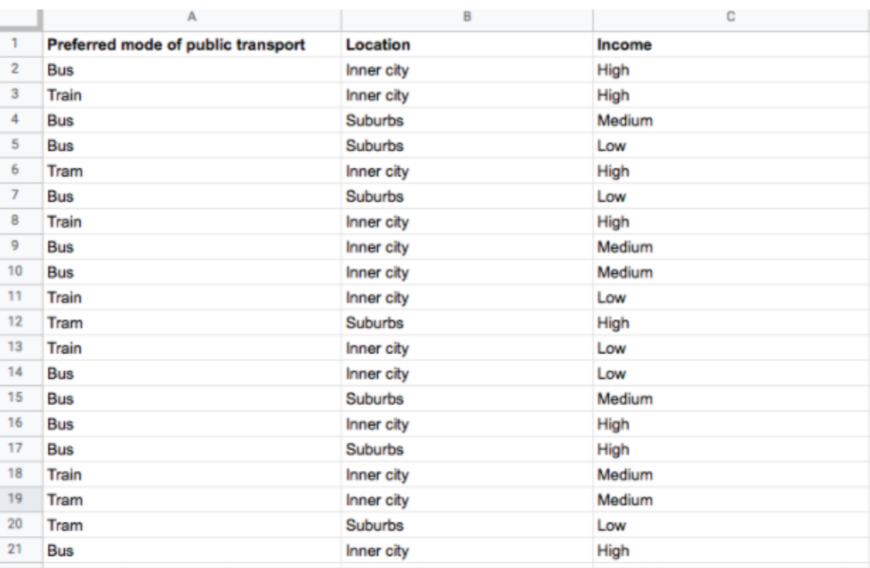
You can further calculate frequency distribution in terms of percentage, allowing you to see the proportion of your respondents preferring a particular mode of transport. Here’s what we’re talking about:
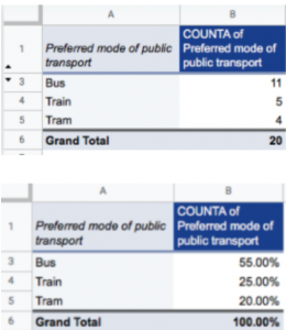
There it is, the first stage of analyzing nominal data through frequency distribution tables.
2. The Measure Of Central Tendency (Mode)
The measure of central tendency, simply called mode, helps identify the “center point” of the entire dataset, the value that appears most frequently within a dataset.
For nominal data, the mode is the only measure of central tendency to use. To identify it, look for the category that appears most frequently in the distribution table. For example, “Bus” had the highest response (11 out of 20) in our example, and that becomes our mode.
See, through the use of frequency distribution tables and mode, we’ve got an overall picture of our nominal dataset. It’s not in-depth, but it’s an analysis nonetheless. Through descriptive analysis, you already know which mode of transport people prefer.
Step 2: Visualizing Nominal Data
Data visualization involves presenting the entire data in a visual format. Like descriptive statistics, visualizing your data helps you see what it is telling more easily. Some simple and effective data visualization methods are bar graphs and pie charts. You can do this through Microsoft Excel by clicking on “Insert” and then selecting “Chart” from the menu that comes.
If you’re looking for a more intuitive option, SurveySparrow‘s auto-generated, shareable reports let you quickly arrange the data as word clouds or bar charts. Its data dashboard also helps you effortlessly visualize the data as different widgets. Depending on the data type, you can take your pick from word clouds, trend charts, donut diagrams, bar charts, and more.
Want to try out our features? Create your FREE account below.
Step 3: Statistical Analysis
While descriptive statistics and data visualization only summarizes the nominal data for simple analysis, inferential statistics let you test a hypothesis by digging deeper into what the data is telling.
Non-parametric statistical tests are used for nominal and ordinal data. So, when analyzing a nominal dataset, you will run the chi-square goodness of fit test if looking at one variable. And a chi-square test of independence if we have two variables. So, let’s learn about both of them:
1. Chi-square Goodness Of Fit Test
The Chi-square goodness of fit test helps in assessing whether the data you’ve collected represents the entire population or not.
In our example, we gathered data on the preferred public transport of 20 New Yorkers. Now imagine that, before collecting this data, we looked at the historical data published on popular public transport and hypothesized that most people from New York will prefer traveling by train. However, based on the collected and analyzed data, a bus is the most popular travel method.
We wish to know how accurate our findings are for the entire New York population. But, of course, it’s not the best idea to gather data for every person living in a vast city. So we use the Chi-square goodness of fit test to analyze the gap between our observations and our hypothesis.
2. Chi-square Test Of Independence
If your goal is to explore the relationship between two nominal variables, use the chi-square test of independence.
Going back to our example, we collected data on the respondent’s location (inner city or suburbs). To analyze if there’s a correlation between people’s distance from the city center and their preferred mode of transport, we will use a Chi-square test of independence.
So, the frequency of each category for one nominal variable is compared across the frequency of categories for the second.
TL;DR: Gathering descriptive statistics to summarize the entire data is the first, followed by data visualization and then a statistical analysis as the last step.
Bonus: 7 survey questions for collecting nominal data
From our experience of helping companies conduct quality surveys, we know the type of questions that hit a home run. You can directly use these or write your own on the same lines. Well, it’s all yours:
- What would be your native language?
- For the following steps, we’ll be needing your zip code. Can you tell?
- Do you use a smartphone?
- What is your favorite movie genre?
- Which is your go-to mode of travel?
- Name your demographic.
- What sort of winter clothing do you prefer?
Key takeaways & next steps
More than an article, this was a thorough guide on nominal data. We covered everything that should’ve been. To sum it up, here are the takeaways:
- Briefly introduced the four different levels of data measurement: Nominal, ordinal, interval, and ratio.
- Defined nominal data as a qualitative data type grouped into mutually exclusive categories.
- Gave characteristics for nominal data that make it a crucial data type.
- Shared 10 nominal data examples that you’ll easily see in everyday life. Which one did you like the most? Let us guess. Hair color?
- Introduced descriptive statistics for making sense of nominal data. Frequency distribution tables and mode formed the part of this analysis stage.
- Looked at data visualization to see how that can be used in the analysis process.
- Introduced statistical tests for analyzing nominal data: The Chi-square goodness of fit test and the Chi-square test of independence.
- Gave survey questions to collect high-quality nominal data.
Now, start collecting high-quality nominal data from your surveys. You know how to analyze them and the questions to ask. Go, get your data, and grow. We’ll be waiting to hear about your success stories. Until next time. Ciao.


")